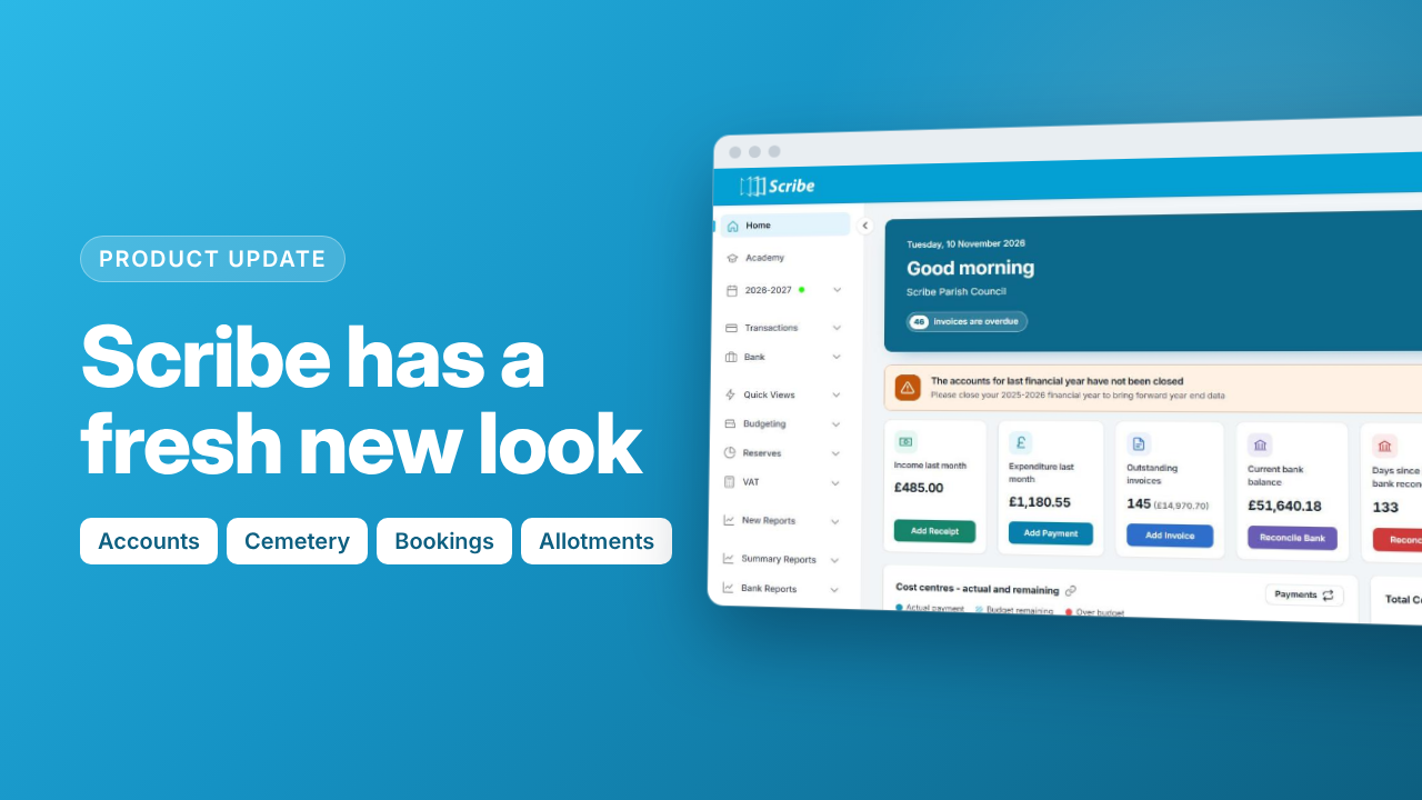
We've given Scribe a facelift. Scribe Accounts, Cemetery, Bookings and Allotments now have a fresh new design. It's cleaner, more modern and easier to read, but everything works just as it did before. Your data, menus and settings stay exactly where they are.
You can switch to the new look from Monday 16th November. From January 2027, it will become the standard design across all Scribe apps for everyone.
How to try it
- Click your council name and user name in the top right-hand corner of Scribe.
- Select New look at the bottom of the menu.
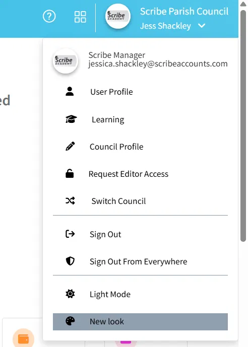
Changed your mind? You can go back at any time before January 2027. Open the same menu and select Classic look.
One design, four apps
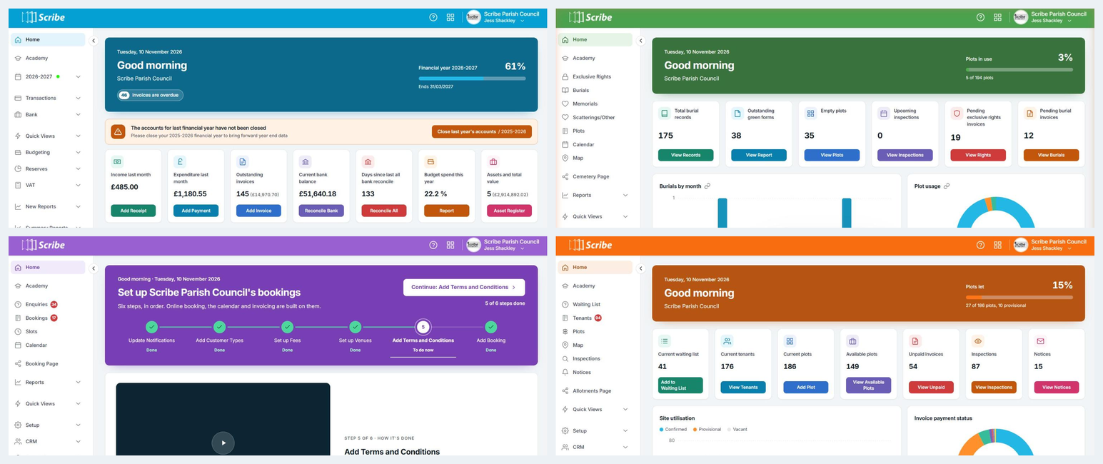
Every Scribe app now shares the same fonts, layout and menus, so if you use more than one, moving between them feels seamless. Each app also has its own colour, so you always know where you are: blue for Accounts, green for Cemetery, purple for Bookings and orange for Allotments.
A new Home page
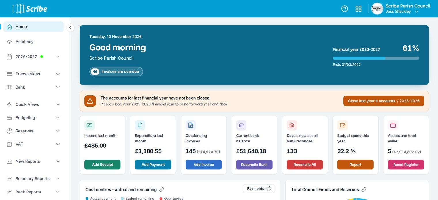
When you log in, a welcome banner shows today's date, your council's name and a progress bar for what matters most in that app. For example:
- Accounts: how far you are through the financial year, plus a count of any overdue invoices
- Cemetery: how many plots are in use
- Bookings: your occupancy rate across all venues for the next 90 days
- Allotments: how many plots are let, including provisional lets
Important reminders, such as closing last year's accounts in Scribe Accounts, now appear as a slim alert bar with a button, not a large tile in the middle of the page.
Your key numbers at a glance
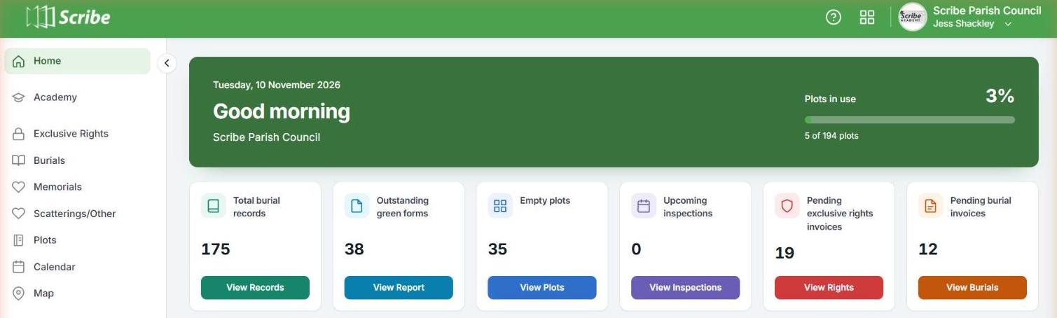
Below the banner, a row of tiles shows your key figures, each with a shortcut button to take you straight to the right place. For example:
- Accounts: outstanding invoices, current bank balance and days since your last bank reconciliation
- Cemetery: outstanding green forms, empty plots and pending exclusive rights invoices
- Bookings: bookings and revenue over the last 90 days, outstanding payments, enquiries and provisional bookings
- Allotments: your waiting list, available plots and unpaid invoices
Clearer charts
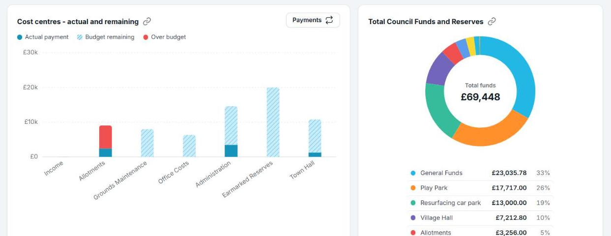
Charts have been redesigned to be easier to read at a glance, with clear labels, a colour key and tidy ring charts that show totals in the middle. For example:
- Accounts: cost centre spend against budget, with anything over budget in red, and a breakdown of your funds and reserves
- Cemetery: burials by month and a breakdown of plot usage
- Bookings: monthly revenue from paid invoices, and the hours booked at each of your venues
- Allotments: confirmed, provisional and vacant plots for each site, and invoice payment status
Switch between apps in one click
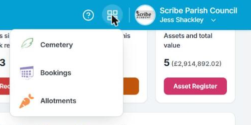
A new app icon in the top bar, next to the help icon, lets you jump straight between your Scribe apps.
Easier navigation
Each app's left-hand menu has the same sections in the same order, so everything is where you'd expect. Icons have been refreshed, sections with sub-menus now have an arrow so you can open and close them, and the page you're on is highlighted.
The menu on the left now has its own scroll bar for easy navigation.
Tidier lists and tables
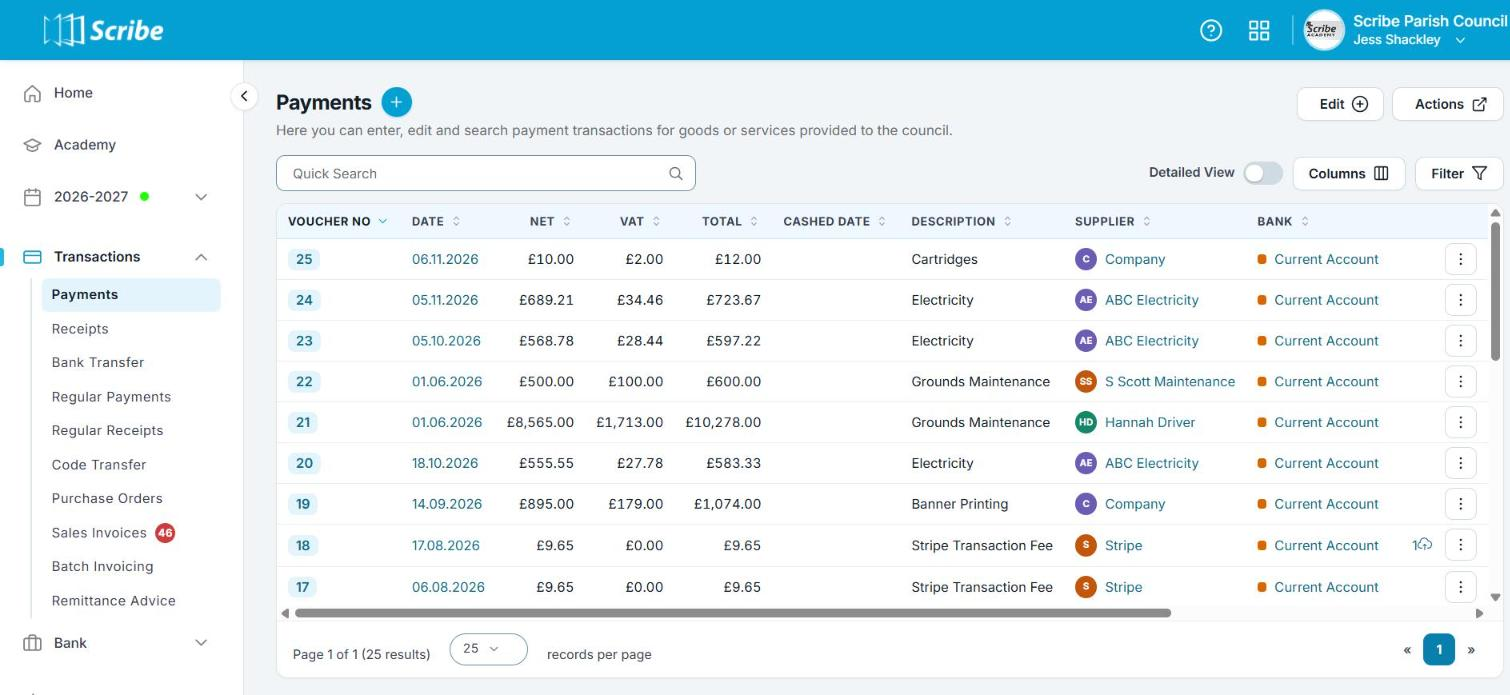
All list views have a cleaner, more compact layout, so you can see more on screen at once. For example, in the Payments list in Scribe Accounts:
- Names are shown with coloured initials, and bank accounts are colour-marked, which makes them quicker to scan
- The page controls and records-per-page option stay at the bottom of the list
- Quick Search, Detailed View, Columns, Filter, Edit and Actions all work exactly as before
What happens in January 2027?
From January 2027, the new design will switch on automatically for every user in Scribe Accounts, Cemetery, Bookings and Allotments, and the current design will no longer be available. There's nothing you need to do. If you try it early, though, you'll have time to get familiar with it before then.